sara silva's portfolio:
special projects_


For the projects that involved more than one tool, i.e., Microsoft Power BI and Tableau.
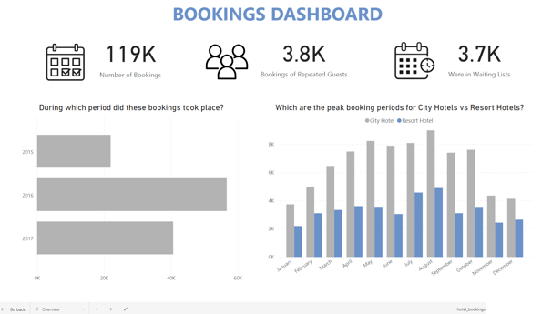
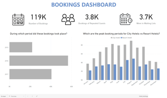
The idea behind this project was to build a similar dashboard in two different tools with the same dataset.
This was a good exercise for me to compare my skills on a tool that I'm already familiar with - Microsoft Power BI, on the left - with a tool that was completely unknown to me - Tableau, on the right - and initiate my journey in the Tableau world.
data visualization:
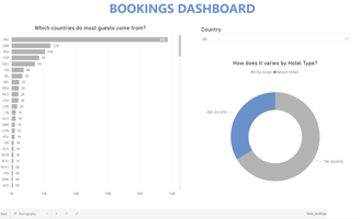
same dataset, two dashboards_
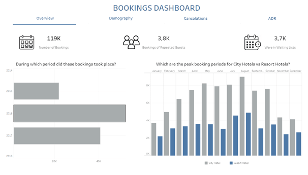
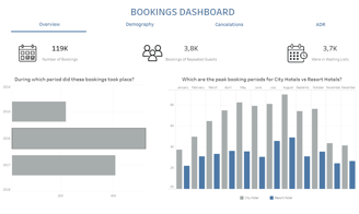
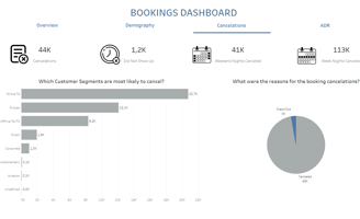
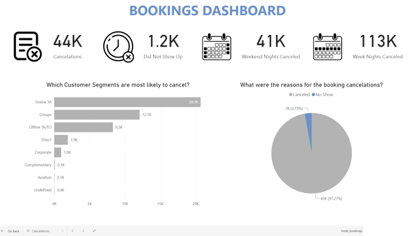
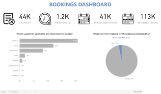
The dashboards have four sections:
Overview - displaying general information of the dataset in hand;
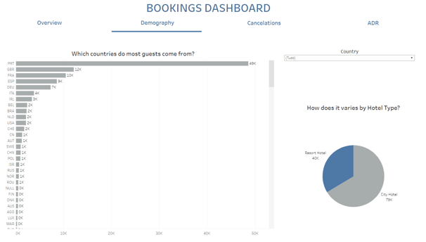
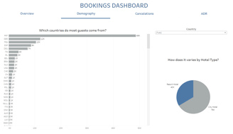
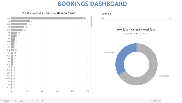
Demography - which allows an analysis based on where the hotels are located;
Cancelations - with specific information regarding the canceled bookings;
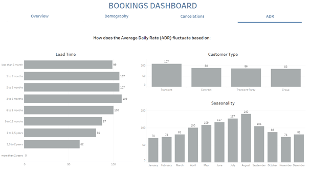
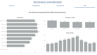
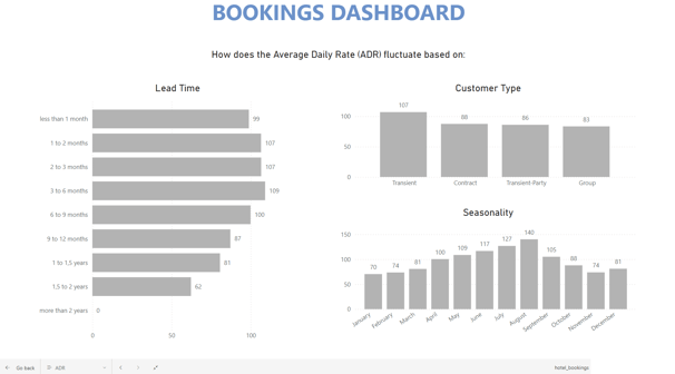
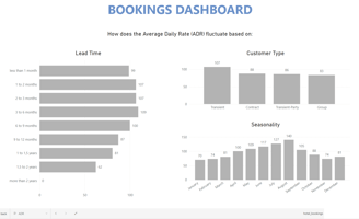
ADR (Average Daily Rate) - which provides some insights in relation to profitability.
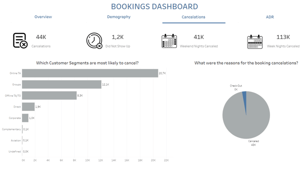
Although the dashboards are intentionally very similar, there is one big difference that immediately stands out - the upper navigation tabs on the Tableau dashboard.
This is clearly a solution that I found in order to be able to display several pages, since this is an unnecessary step on Power BI.
What I first thought as a disadvantage on Tableau, quickly turned out to be an advantage for me, since it enables me to use my creativity and ends up being more pleasing to the eye.
Lessons learned:
how to design and set up the upper navigation tabs on Tableau, using parameters and dynamic zone visibility;
developing the visuals with a question in mind, which can help me better understand what could be the user's needs while looking at the data;
displaying those same questions on the charts, which will help the user to better read and interpret the report.
Check the Tableau project here. The link for the PBI project is unfortunately not available.
Note: The focus of this project was on Data Visualization. The dataset was already fully cleaned, so no Data Cleaning tasks were performed.